n
Этот проект состоит из работ, которые студенты школы Юниверс создали на творческом марафоне по редизайну логотипов. Вместо устаревших и неудобных лого, они нашли для бизнеса яркие современные решения.
This project consists of works created by students during a redesigning marathon. They found bright and modern solutions for businesses, replacing the old logos, which were outdated and inconvenient to work with.
n

RU
На нынешнем логотипе Белорусского народного банка, изображена фигурка льва, облаченного в латы, найденная в Кахетинском регионе Грузии. Поскольку в этом символе нет ничего белорусского, и он не имеет никакой связи с людьми, он совершенно не соответствует названию банка. Предлагаемый ребрендинг направлен на то, чтобы сделать логотип универсальным и гибким. Новый логотип легко идентифицируется, не вводит в заблуждение потенциальных клиентов и дает им ощущение безопасности и стабильности. Он вызывает желаемые ассоциации. Символ является собирательным, с глубокой идеей: он представляет национальную культуру и традиции, а также миссию банка, его принципы и ценности.
ENG
The current logo of BNB (Belarusky Narodny Bank that means People’s Bank of Belarus) depicts the figurine of the lion, clad in armour, which was found in the Kakheti region of Georgia. As there's nothing Belarusian in this symbol, and it lacks any connection to people, it doesn't match the name of the bank at all.
The proposed redesign aims to make the logo universal and flexible. The new logo can be easily identified, won't mislead potential clients and will give them the feeling of safety and stabilty. It evokes the desired associations. The symbol is collective, with a deep idea behind: it represents the national culture and traditions as well as the bank’s mission, its principals and values.
The proposed redesign aims to make the logo universal and flexible. The new logo can be easily identified, won't mislead potential clients and will give them the feeling of safety and stabilty. It evokes the desired associations. The symbol is collective, with a deep idea behind: it represents the national culture and traditions as well as the bank’s mission, its principals and values.


Follow me in Instagram
1

nn
RU
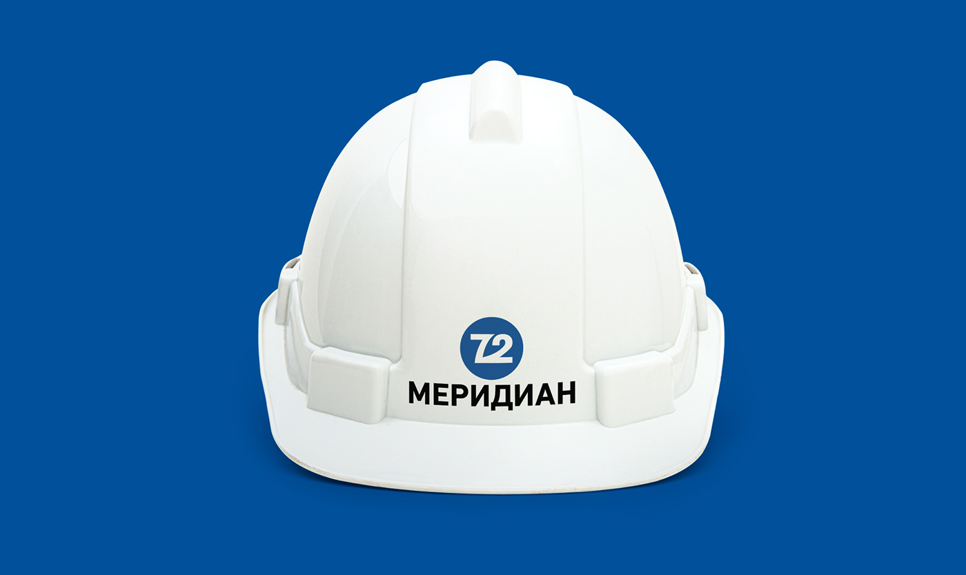
Логотип был разработан в 2011 году и с тех пор не обновлялся, полностью утратив свою тенденцию. Много лишних букв, при небольшом размере название не читаемо, особенно внизу. Шрифт не подходит под тематику компании. Овал занимает очень много пустого пространства и визуально такая композиция выглядит тяжёлой. Разработав новый дизайн, у компании откроется второе дыхание, а сейчас создаётся ощущение, что вместе с этим логотипом компания медленно умирает (по недавней статистике у них уже были проблемы на грани закрытия и проблемы с сокращением персонала).
Логотип был разработан в 2011 году и с тех пор не обновлялся, полностью утратив свою тенденцию. Много лишних букв, при небольшом размере название не читаемо, особенно внизу. Шрифт не подходит под тематику компании. Овал занимает очень много пустого пространства и визуально такая композиция выглядит тяжёлой. Разработав новый дизайн, у компании откроется второе дыхание, а сейчас создаётся ощущение, что вместе с этим логотипом компания медленно умирает (по недавней статистике у них уже были проблемы на грани закрытия и проблемы с сокращением персонала).
ENG
The logo was designed in 2011 and since then has not been updated, completely losing its trend. A lot of unnecessary letters and at small sizes the name is not readable, especially near the bottom. The font does not fit the theme of the company. The oval takes up a lot of empty space and visually such a composition looks heavy. Having developed a new design, the company will have a second wind, but now it seems that the company is experiencing a slow decline with this logo (according to recent statistics, they were on the verge of closing and had to cut down their staff).
n